On Monday I delivered to a client the softest, most supple wool and linen blend suit that I have yet seen. It literally appeared to make his body physically cooler within mere moments of putting it on – okay perhaps that’s a stretch but in comparison to the fully lined suit it replaced it seemed that way! When I asked what he was most excited to pair it with an he stated the following: sockless with loafers, a crisp white shirt and a statement pocket square. We then got into a discussion about how in the summer the pocket square sometimes takes on the role of de facto tie – a scenario that particularly plays out here in relaxed, dressed down Vancouver. Coming on the heels of last weeks post on ties it seemed like a logical next step in terms of subject matter for this week.

The de facto tie?
To many a sartorial purist even asking this question is blasphemous. To the rest of us it simply makes sense. As Vancouverites it’s safe to say we’re not exactly accustomed to the heat – by removing the tie and opening the top of the shirt we quickly get much closer to a comfortable body temperature. We also get that much closer to appearing purely casual – as such enter the pocket square to save us from going to far over edge.
But first a cautionary note.
Before we get into the squares themselves though we need to address the suit itself as not every suit can shed the tie and look right. Formal and traditional power suits are only that – they need to be worn to their fullest and look incomplete when the tie is removed. What suit looks appropriate dressed down is often a very personal matter. For me the following looks are an example of just that – in essence they’re trying to bring too relaxed a mood to a formal base which simply doesn’t work to my eye.
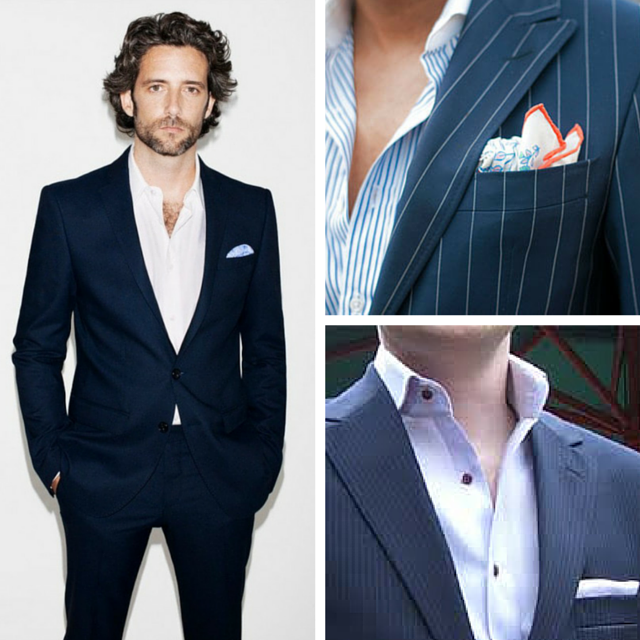
To achieve the more comfortable yet appropriate look we desire we need to be going with less traditional business cloths. Plain cloths that are flat or textured, subtle patterns, open weaves and suits that are lighter weight and more unstructured are where to begin. The image below is a great example of this – it’s able to walk the line between formal and informal beautifully due to its weight, color, type of weave and its more informal patch pockets.

Less is more.
I’m going to repeat what I said last week as it’s equally crucial to keep in mind – when we talk about less is more we’re referring to both the design of the pocket square as well as having a very curated selection to keep things versatile and orderly. May I remind you to keep the 90% rule of the menswear game in mind – that 90% of all suits sold are either navy or grey; and that 90% of the shirts sold are in white, baby blue or a combination of the two. As such when you’re starting to build your wardrobe it’s crucial to get the basic elements right from the outset. There is a reason for the 90% rule – each element works seamlessly with the other. Keep that in mind as you build out your pocket square collection.
With that in mind here are some tips to nail your pocket square game.
1. Start with plains.
Sound familiar? Whether we’re talking suits, shirts, ties or pocket squares the initial rules stay the same. As stated above seamlessly working together is the first key as is simply becoming comfortable with the act of wearing a square.

Do note that white is not the only plain option though it is by far the most common. Baby blues, forest green, burgundy – these are just a few soft and warm plain color options you could also go with from the start. As for the border – I must admit that it’s a personal favorite of mine. A way of adding a dash of color in an otherwise very simple look.
2. Add some dots and subtle pattern.
A bit of a departure here – in the tie world I suggest these as two separate steps with the dots coming first. In the square world we’re allowed to advance much quicker hence the combination. My advice here is to keep relatively focused in terms of the colors that you add – the goal is a color palette that enables seamless usage while still adding versatility and personality to your overall look.

3. Go bold.
Again – a bit of a departure. I’m definitely not a huge fan of the bold, loud tie – that said what I can get behind though is the bold pop of the pocket square. Because the nature of the square is subtle it allows us that much more freedom in terms of its impact. Below are some personal favorites.

4. How to wear it.
I’m not going to go into this with much depth as the internet is literally filled with hundreds of “how to” posts. My only point is this – the more bold the square the more bold the way you wear it. If you look at all of the images in this article by far the ones in the bold section are the most whimsical in terms of how they are thrown into the breast pocket. Simple and subtle – go with a simple and subtle fold. Bold and loud – go with the equivalent artistic and architectural placement.
And lastly – a touch of shirt advice.
Darker shirts are definitely experiencing a touch of a renaissance lately – especially when worn casually with a jacket that is lighter. There are a few examples above and in all of them the color in the pocket square pops quite beautifully in relation to the darker backdrop. Given that you might want to consider a navy button up shirt – just saying!
As always I’d love to hear your opinions on this or any sartorial subject for that matter. Better yet book a free appointment and we can banter in person and see if we might be a good fit to work together.
Take care – Michael
info@martinfishertailors.com


