
Fittingly – based on yesterday’s post – I’m dropping off this odd jacket to Top 30 Under 30 photogrpaher John Bello later this afternoon. If you’re in need of a fantastic photographer this is your guy – check his site out at johnbello.ca
Fittingly – based on yesterday’s post – I’m dropping off this odd jacket to Top 30 Under 30 photogrpaher John Bello later this afternoon. If you’re in need of a fantastic photographer this is your guy – check his site out at johnbello.ca
Over the past few weeks the focus has been on achieving the perfectly fitting pant; we now shift upwards and look at the jacket from a few different perspectives. We open by discussing the odd jacket; arguably the most important – and versatile – piece a man can have in his wardrobe.
In general men are wearing fewer suits today, but many guys retain the need for a jacket to elevate their appearance in certain professional or social settings. This is where the odd jacket checks into the game.
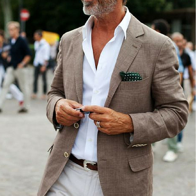
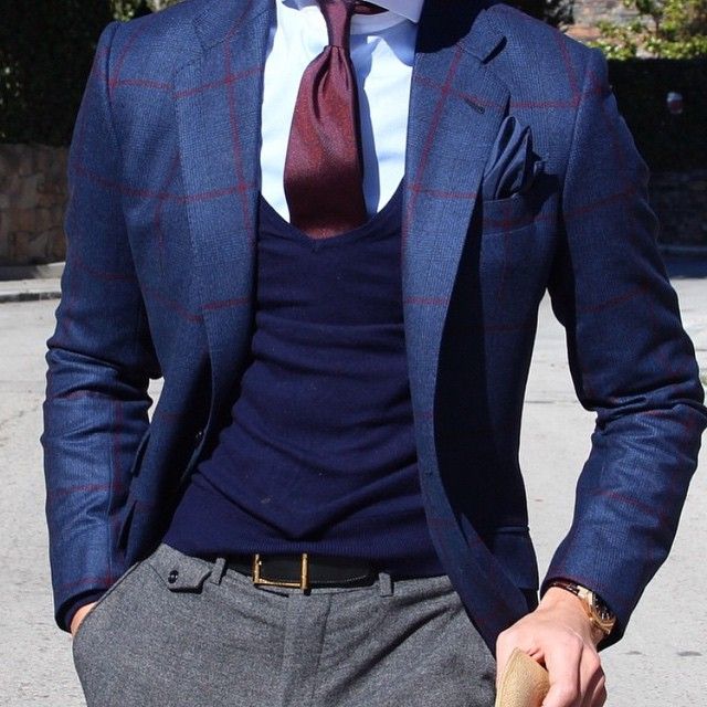
Before anything else remember it’s an odd jacket – meaning the pants don’t match. There should be no confusion thus the texture and pattern of the jacket needs to be clearly different. In saying that though the two pieces need to compliment each other; as a rule they should at least be within a rung or two on the formality scale.
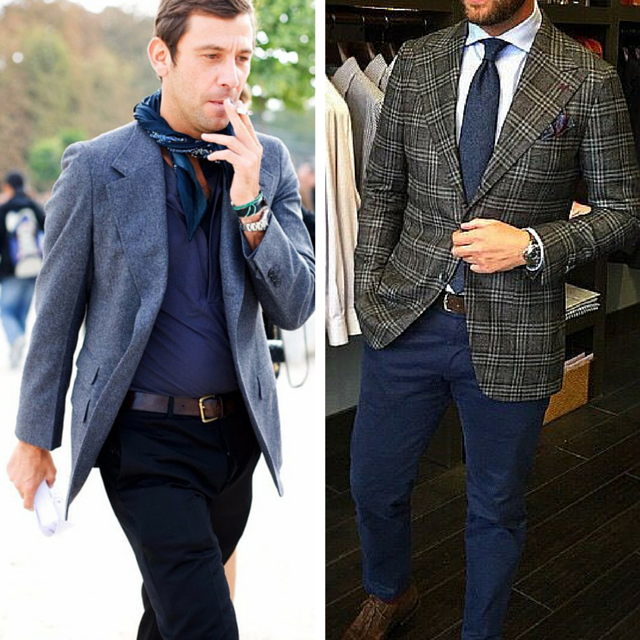
A great way to show this is via the very dangerous suit jacket with jeans look:
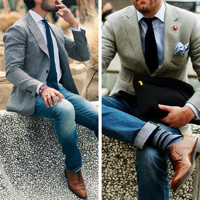
Suiting is made of worsted wool which is treated to be smooth and luxurious in its hand; jeans on the other hand are the complete opposite hence the two don’t necessarily compliment each other which can result in a forced and disjointed look. The fellow on the left is clearly in a suit jacket thus a few rungs away from his jeans; the one on the right gets a pass though as his jacket is of a rougher texture making it more casual in nature.
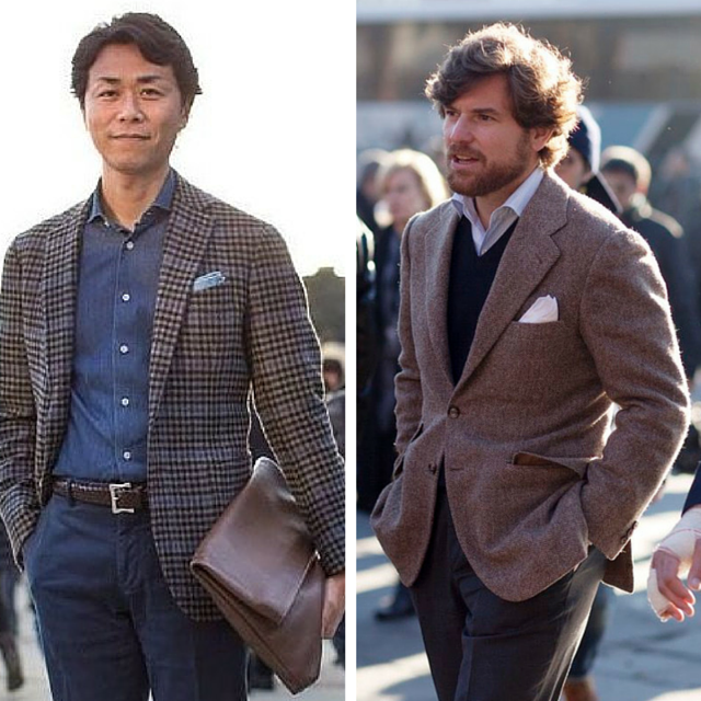
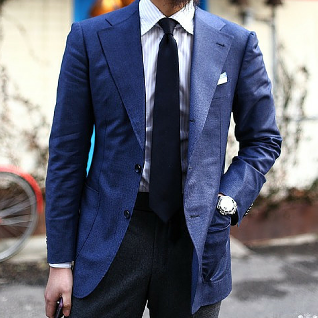
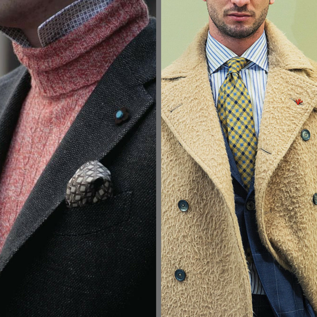
With that in mind always be thinking about texture, weave and pattern. The odd jacket allows for a perfect amount of flair in terms of selecting interesting and rougher cloth. This is due to the fact that more often than not our pant choices are relatively neutral. Flannel has a level of surface interest that allows it to walk the line between formal and more casual. Hopsack, sharks-tooth, mohair are good options as are subtle patterns such as a herringbone or hounds-tooth. On the more casual side you can look towards tweeds as well as cotton and linen for the warmer months. Here are a few examples:
Keep in mind the opening point above – the jacket needs to be clearly different than the pant. The cloth selection assists with this as does the colors we choose. I’m a big fan of monochromatic looks but you must always walk the line carefully. A subtle color change in combination with very different textures works well; so to does a stark color change in combination with a subtle textural difference. Part of what is so fun (or infuriating!) about the odd jacket is playing with these little nuances.
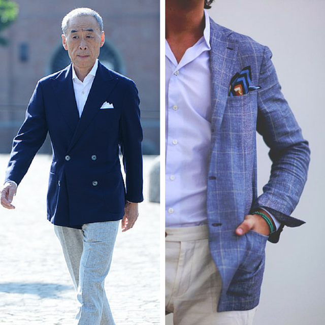
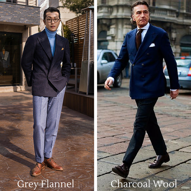
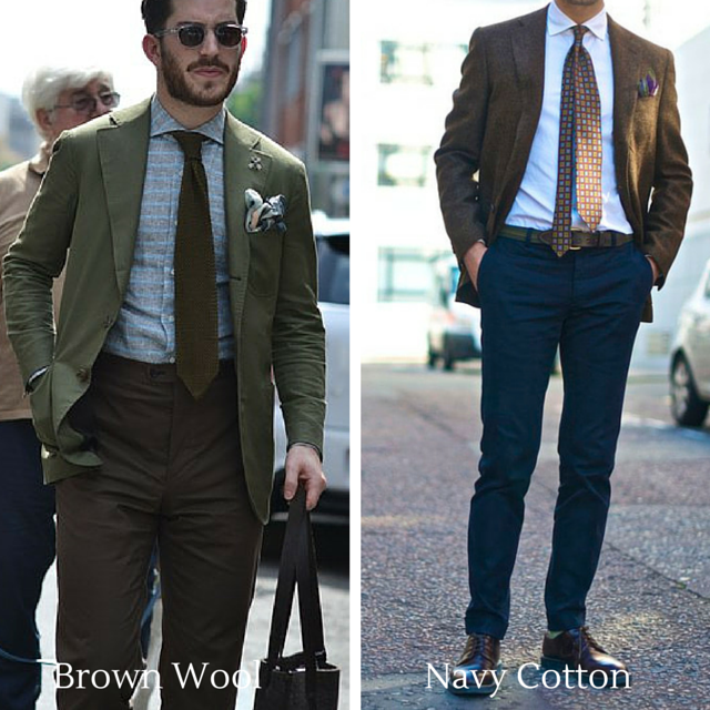
For the best results and by far the easiest to execute I suggest shades of grey, navy and brown. I’ll throw olive in there as well though I get that it might be a stretch for some! Here are a few examples to help you envision some different looks:

I’ll start by saying you can cut an odd jacket closer than your typical suit jacket. This is because you’ll likely wear it unbuttoned more than done up; this being simply the nature of a more dressed casual look.
Next is to pay attention to the relationship with the pants – specifically with the rise and the mid-section as a whole. In today’s style as pants move towards the casual end of the formality scale they typically start to have shorter rises and lower sitting waists. The result is longer cut jackets look proportionally off as there is too much space between the bottom of the jacket and bottom of the crotch. Take a look at all of the examples I’ve used in this post – the majority have the end of the jacket and bottom of the crotch being essentially even. Start paying attention to this aspect of your look as nothing can make a man look more awkward!
As we just learned it starts with the rise – the shorter it is the shorter the jacket will need to be to compliment it. As a pant gets more traditional and longer in the rise; the longer the jackets length can become.
In terms of choices I’ll suggest five key pants for pairing with odd jackets:

Lastly – I can’t help but throw in a wildcard; the white pant. Anyone who has spent time in Italy during the summer will know that this pant is everywhere in that country. As someone on the paler side of the complexion scale I’m still unsure if I can pull it off; anybody with olive or darker tones I say go for it as it does look great!
This element isn’t often touched upon as its hard to nail down exactly what makes a look work. What is certain though is that the odd jacket is all about versatility – it could be thrown on to elevate your look for an impromptu business meeting or it can do the opposite and reduce the formality of a look. What I mean by this is that an odd jacket is less formal than a full suit hence you can play with the mood you are going for while keeping yourself relatively high on the formality scale. Here is a perfect example:
It can also take a very casual and playful look and give it just the right amount of panache for a dinner party or a late afternoon event – the images below are two great examples:

When used to its fullest potential the odd jacket is easily the most transformative and versatile piece in your closet – regardless of whether it’s the cooler winter months or in the heat of the summer.
I’d love to hear your opinions on this post – did I get it right or are there a few elements I left out? Comment within the blog, send me an email or even give me a ring – your feedback is important so please don’t hesitate.
Thanks for reading – take care.
Michael
info@martinfishertailors.com
A view into the behind the scenes process of Parisian tailoring house Camps De Luca…
Pretty inspiring…
Time to debate!

Of all the classic elements that men wear on a daily basis none are quite as unnecessary as the neck tie! Completely decorative in nature it is there simply to provide a glimpse into the personality of the wearer. With that in mind beyond the characteristics of tie itself the most telling aspect is how one goes about knotting the tie. Three styles to choose from today:
Left – no dimple Middle – the fjord-like dimple Right – subtle dimple with a twisted tail
As you can tell from the title’s post my assumption is that you would dimple in some form or another. From my vantage point it simply increases the visual interest of the knot by adding depth and a more fluid shape. As for the twist – many assume it’s an accident and that the tail has simply spun out of control. Not the case – the twist often adds a second dimple and allows more of the tie to be seen which can add to the visual interest. Who wouldn’t want to see more of the beautiful prince of wales check tie that we see in the image above?
So what are you going to choose?
Let the debate begin…
I’ll start with an apology for a potentially misleading title; if you’ve come to look for advice on how to punch up your wardrobe with bright color I’m afraid you’ve come to the wrong place! Subtlety is the boss in menswear and this isn’t likely to change despite the best efforts of all the stylists out there.

1. Navy and grey are king – period. These should always be your first two choices for almost every item of clothing – be it a suit, an odd jacket or trouser, an overcoat or rain jacket, a sweater, even ties. The most important factor is how beautifully they combine together providing the base for your wardrobe to be built outwards from. Combine all of the above items in any way you desire with a white or baby blue shirt and you’ll be absolutely on-point for every possible occasion.
2. Baby blue and white – the crown princes to the king. This is fairly obvious but it needs to be stated every once in a while just to keep your mind at ease. This applies to the world of shirting more than anything else – the fact that 90% of shirts sold are in these two colors is a telling stat. The warmth of baby blue works perfectly with every complexion; while the crisp and sharp appearance of white is pretty close to perfection. You can never have too many of either.
3. Brown. Potentially a surprising choice but I’m still stunned by the lack of brown worn by guys on a daily basis. The obvious place to begin is with leather goods – shoes, belts, watch straps, wallets and bags. The richness and wealth of patinas that can be formed in brown leather is unparalleled and with it comes the ability to absolutely transform even the most basic look. Brown is also a perfect compliment for navy, baby blue and grey – be it in a tie, the border on a pocket square, the stripe on a white shirt or via the richness of a cashmere sock.
4. Green – the third color. I refer to it this way because while being a great complimentary color it’s also equally strong standing on its own. Olive chino’s are a wonderful break from navy, a military inspired field coat is great for a secondary jacket option as is a rich forest green wool sweater or overcoat to work beautifully when combining with navy and grey. Quietly green has rightly emerged as the go-to third choice.
5. Pink and purple – a nod to nature. When I need a bright hit of color in the flower department these are my go-to; the deeper and richer they are the better. The same goes for using these colors to compliment the basic pieces in your wardrobe; in essence we’re taking what happens in nature and applying it to our clothes. A pink shirt with a brown tie on a navy or grey suit, a purple check shirt worn with a light grey cardigan with a navy blazer; rich and full with enough pop to be visually interesting.

My last piece of advice – play with all the shades and textures of cloth that are available to you. Clients are always surprised by how many shades of each color there actually are and by how different they look when done in different cloth types. An olive green in cotton twill looks, feels and has a mood that is completely different than when it’s done in a wool flannel. Most importantly though have fun with this part and keep experimenting – it is exactly for this reason that I suggest working from a limited color base in the first place. Master this aspect first and then decide if you want to become bolder in your sartorial decisions!
I’d love to hear what you think of my suggestions – did I miss something? Too conservative and boring? Too aggressive? And also don’t hesitate to send pictures of you best combinations.
Thanks for reading – take care.
Michael
info@martinfishertailors.com
Time to debate!
Apologies for the late post – Friday got away from me hence better late than never!
As the non-winter we’ve experienced here in Vancouver slides away we’ll soon be putting away our overcoats and be back to layering with knits. I’ve noticed a few of these low cut style sweaters making their rounds on some European based tumblr and instagram accounts and thought I’d put it there for some opinions. My two cents – I don’t like it one bit and put it in the same category as its t-shirt cousin seen here:
For me it’s too contrived a look – guys trying to be slick and showy just for the sake of it. Perhaps I’m just a traditionalist!
Enough about my thoughts – what do you think?
Let the debate begin…
Hopefully following this third and final post of the Perfect Pant series this will no longer be the case. Over the past two weeks the focus has been on what’s happening on the top half of the pant – Part I dealing with the rise while Part II focused on the seat, waist and thigh areas. Today we shift to the bottom half of the pant and explore the importance of cohesively blending the two elements together.

I’ll start with a blatant but fair generalization – the vast majority of guys wear their pants too loose through the leg and too long. All this does is add unnecessary visual bulk that can make a guy look 10-15 pounds heavier than he actually is. Oddly we have two Hollywood heavyweights to provide us with examples of what not to do:

Just in case you didn’t know – all pants are tapered. Our bodies are naturally tapered thus clothing needs to follow that form. The question though is how much to taper? There are two keys to this:
The first is to follow the proportions and shape of your body.
The goal is to create a visually pleasing line whereby the thigh, knee and bottom measurements of the pant are balanced proportionally. If the taper is too aggressive then you’ll make your thighs and seat look bigger than they actually are. On the other hand if the taper isn’t enough then the bottom of the pants will be visually heavy making the top look awkwardly small.

In the above images we have four distinct looks that are being pulled off with varying degrees of success. Numbers one and three – classic examples of overaggressive tapering.
#1 – He’s not a big man but he definitely holds his weight in the mid-section. The effect of the aggressive taper is that he appears to have ‘chicken-legs’ in relation to the rest of his body.
#3 – Apologies for his being slightly hidden but I think you can see that he has a fuller chest and quite a developed seat. Instead of balancing out the fact he is top heavy he has emphasized it with the aggressive taper.
The exact opposite has occurred with numbers two and four as they have achieved perfect balance and proportion for their body types.
#2 – He is smaller in terms of height but has some width in his upper body and seat area. With this in mind he has chosen a slightly more relaxed fit through the seat and thigh of the pant; a line that he has maintained with a consistent, soft taper down through the knee toward the pants bottom. The result is total balance and a look that is relaxed yet trim.
#4 – This guy follows the same principle despite his body being a polar opposite with height and skinniness. His level of taper is certainly an aggressive one; this is okay though because he is equally thin through the seat and thighs. The balance is maintained thus the top and bottom sync up with one another.
The second factor comes down to style.
The dominant style of the day is unquestionably a trimmer fit. Based on the factors we just discussed this trim look can manifest itself in varying degrees – from a slimmer look to a slightly fuller look. Honestly assessing your body type and then blending it with your fashion sense is a highly personal choice – there is no right or wrong but at all cost avoid loose and sloppy. Here are some examples to guide you:

#1 – A slightly fuller trim #2 – A slightly slimmer trim

#3 – Trim on a fuller body #4 – Proportionally trim
When discussing the break of a pant what we’re essentially referring to the length of your pants. The break is the fold or bend that occurs in the vertical line of the pant when it hits your shoe. The longer the pant the more break there is; conversely a pant that doesn’t hit the shoe has no break at all. Generally there are four breaks as seen in the images below: 1) no-break, 2) quarter-break, 3) half-break and 4) full-break.

Technically there is no right or wrong when it comes to your pant break. It simply comes down to personal preference and what specifically works on your body type. As a general rule of thumb though I recommend guys to start with a quarter to half-break – they represent the best of both worlds and allow guys to get a sense of what they feel comfortable with.
Some loose rules to follow.
The shorter you are the less break you should have – the idea being that an unaltered line of the pant acts to elongate your legs and make you appear leaner and taller.

The taller you are the more break you should have – the idea being that the folds will break up the vertical line thus softening the impact of the height.
For those of you wanting to be fashion forward and have the shorter look please do so with extreme caution. It only works when the width of the bottom is quite narrow – we’re talking between 14-15 inches in total circumference. The key being that as you move the bottom shouldn’t be wildly flopping around – if that is the case then it simply appears that your pants are too short. Here are two examples of it done properly:

And lastly – wear beautiful shoes. My biggest frustration with pants that are too long is that it’s a missed opportunity to show off your shoes. Sloppily burying them under mounds of cloth does nothing for you – polish them up, show them off and set you yourself apart from the pack.
Thanks for reading – I’d really like to hear from you in terms of your thoughts on the entire Perfect Pants series. Was it helpful? Did I miss anything? Are there any other areas you’d appreciate my delving into?
Take care,
Michael
As I stated last week the role of the pant is a supporting one; the jacket undeniably being the star of the show. Even other supporting characters like shirts and accessories get more attention as easy ways to add a bit of pop to a look. No more – it’s time for pants to get their due!
Stylistically pants ground and set the tone for an outfit. They’re also the workhorse – you can undo a jacket or loosen a collar but a pant is always worn to its fullest. For these reasons a perfect fitting pant is crucial. Today is the second post in a three-part series on how to achieve exactly that perfection.

Always start with the seat. In tailoring a pant is based off the seat measurement as opposed to the waist. The seat represents the widest part of the body thus we first establish the width at this level and then shape the area above (waist) and below (thigh) as much as necessary.
Likely this is opposite to every pant purchase you’ve made as standardized clothing is based off the waist and outseam length measurements. This is a major problem as there is essentially no standard waist to seat ratio. The result is that most guys have a choice to make; fit for the waist and have tightness through the seat verses fit for the seat and have a loose waist. The debate is over – fit the pant to the seat and then alter for the waist.
It’s a combination between the actual dimensions of the pant and the aesthetic of its style.
Undoubtedly the best dressed guys base their style decisions off the their body type. They understand what works for them and what their limitations are. In other words; just because you appreciate a certain look and style doesn’t mean you should be wearing it.
Also keep in mind the influence of fabric. Wool is light, airy and fluid in terms of its natural drape. Cotton on the other hand is heavier and doesn’t have the same fluidity in its movement. It will also stretch and ‘bag out’ in a way that wool will not. This means we generally cut cotton closer to the body to allow it to take the shape of the wearer. With wool we cut slightly looser due to the lack of stretch but also because it’s visually lighter.
The seat & hips
Irregardless of style and cloth a pants fit through the seat should remain relatively the same. Due to the anatomy of our backsides it’s expected that we’ll fill out the seat area of our pants. That said there should be adequate coverage with no sign of strain at the middle seam nor any pulling from the sides and pocket area. Equally there should also be no extra fullness pooling in these areas. As a test you should be able to easily grab an inch or so of cloth between your forefinger and thumb at the widest part of the seat. The image below right is a great example.

Also critical is what’s happening on the front of the pant at this level – see the above left image for a good fit. The ‘filling out’ effect can never happen at the front – this is from a style and comfort point of view as well as out of respect for the general public. As discussed in Part I the hips are in constant motion so this is an area of high tension. Adequate ease is crucial at the front hip area or else the pockets will flare and you won’t be able to fit anything into the front pockets. Too much cloth though and you look sloppy.
To assist you here are some rough numbers as a guide; to figure this out simply measure your pants at the widest point of the seat and compare them to your own seat measurement. With wool the seat of the pant should measure between 2 – 2.75″ more than your actual seat measurement. With cotton it should measure 1.5 – 2.25″ more.
The waist
Ultimately the waist should sit comfortably exactly where its designed to sit – be it at the natural waist or lower towards the hips. What determines comfortable comes down to personal preference – as a guide I usually cut pants a half inch bigger than a clients actual waist. It’s about one finger of room – just enough so that things aren’t tight when you’re sitting, but firm enough that it’s locked in place when standing and moving. Keep in mind that a pant shouldn’t need a belt – it’s decorative as opposed to functional.
A special note for those of you with small or flat seats. Typically two things happen in this case; the first is that the waist will always drop at the back creating a roll of excess fabric right below it. The second element has the area behind your quads collapsing which leads to a pool of cloth in the back and inner thigh area. To deal with this effect when I make the pant I’ll simply reduce the height at the back – this eliminates the excess by pulling everything up and off the back of the quads. Easy enough when making the pant from scratch but definitely something you can alter even if you’re buying off-the-rack – it may cost a bit but it’s necessary and worth it.
The thigh
The thigh is crucial to get right as it has a massive impact on both comfort and style. It must be noted that as silhouettes get trimmer and trimmer it becomes quite tricky to get that balance absolutely perfect.
The first thing to keep in mind is that all of us have to sit down – be it for short periods in a car or for long stretches at the office. This leads to an expansion of the quads that simply needs to be accounted for in the width of the thigh. I mention this because consistently I meet guys who want a very trim look through the thighs only to find sitting very difficult. The reality is that your body and its dimensions dictate how trim you can go; know your bodies limitations and go from there.
Here are some rough numbers that will guide you in this process; keep in mind the importance of the impact of different cloths. With wool the thigh should measure between 3 – 4″ more than your actual quad measurement. With cotton – due to the fact that it stretches naturally – it should measure somewhere between 2.5 – 3.5″ more. These numbers will provide you with a trim style on the low side and a clean yet slightly more relaxed look on the high.

A fair amount to digest – as always let me know if you have questions or comments. Take care.
Michael
I got a lot of feedback from Part I of last weeks Perfectly Fitting Pants post – it’s great to hear from you so please keep the questions coming. One of the more interesting ones had to do with the ripples that occur on the inside thigh of pants when they come under stress – be it from sitting down or when striding as we walk. It’s a fitting question as it very much ties into this coming Wednesday’s post. That said I’ll address it today as it’s a specific enough question that it won’t be sufficiently dealt with in the post.
For those of you who are unsure what we’re referring – take a look at the image below:

I’m sure this looks familiar – it’s one of the more miss-understood aspects of tailoring as these ripples often get labelled as the result of poor sewing. This is definitely not the case; the real reason is ease. In the context of making tailored clothing ease refers to the joining of two pieces of cloth whereby one side is longer than the other. The short side is stretched to fit while the longer side gets eased in with the extra fullness being evenly distributed along the full length. That fullness is what you see in the form of ripples when the thigh area get stress put on it.
Still with me?
Hopefully this is making some sense! In the case of the pants the fullness is put into the front of the thigh. There are two reasons for this – the first is that this extra fullness is critical for when we sit down. Because our seat and upper thighs are pressed into a surface we want that extra room to be on the top/front of the thigh. The second reason is that it creates a cleaner line of the pant at the back of our quads. You want the fabric to fall straight from the seat towards the knee without it collapsing onto your quad – adding shortness assists in this process.
Apologies – this was a bit of a tailoring geek-out but I hope it helps somewhat in understanding how your pants are constructed! As always let me know if you have any more questions.
Michael
info@martinfishertailors.com
Time to debate!
This week is a battle between my two least favorite trends of fall 2014/15. I’m a huge fan of wool overcoats but I don’t understand the stringy wet sheep look that took off with the Pitti Uomo crowd this winter. I also appreciate a light turtleneck but it confuses me as to why you would want a collar underneath – redundant and uncomfortable in my opinion.
So which is the worst offender of fall 2014/15 – the wet sheep or the double collar?
Let the debate begin…


