5 Summertime Sartorial Thoughts.

We’ve recently been experiencing a level of heat and humidity that is most definitely not typical to Vancouver.  As a result I think there are a lot of guys who are looking over their summer wardrobes with a different mindset and as such are realizing there are likely a few holes and changes that need to be made.  The following is a collection of thoughts that deal directly with the heat as well as some general summer style commentary.

5 Summertime Sartorial Thoughts.

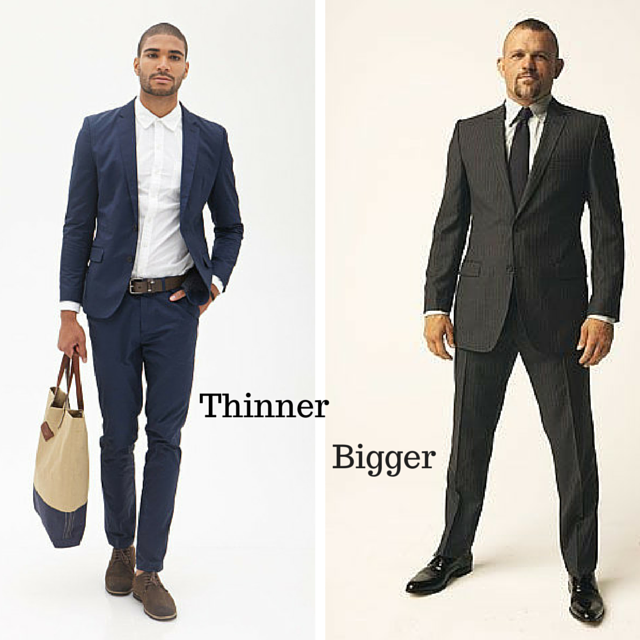
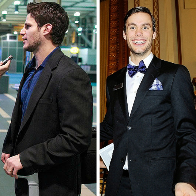
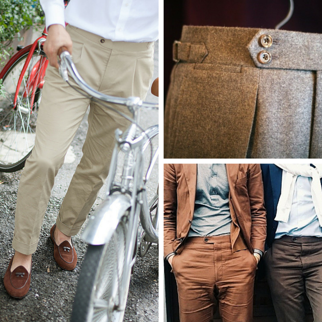
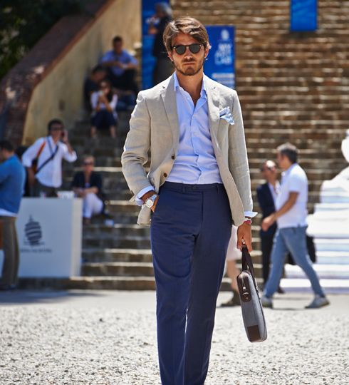
1. The importance of relaxed trim – breathability is critical.

I touched upon this subject earlier as we were transitioning into the warmer weather but as the temperature goes up I feel it necessary to hammer the point home.  The context I spoke about it within is in how we are beginning to see a bit of a more relaxed silhouette – the focus shifting from overly trim to what I call relaxed trim.  As a reminder here are some pictures I previously used.

Summertime Breathability

The importance of this is most evident in the summer – this is because overly fitted clothing becomes clingy and sweaty when the heat gets turned up.  By wearing clothes that are a touch looser we allow air to get in between the cloth and our skin which is wonderful for cooling us down and making us look more at ease.  This is because tight and sweaty never looks good – regardless of what it does for your silhouette.

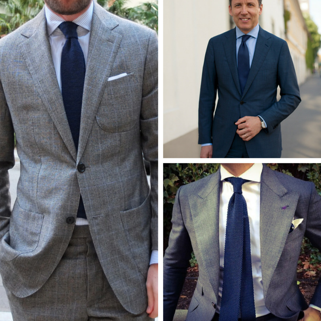
2.  Hands in pockets with trim pants – be very careful.

This is more of a tip for those of you who are wearing your pants trimmer and shorter.  As I mentioned above this leads to less fluidity in the cloth and hence more sweat and stickiness come the heat.

The result of all this heat and stickiness is the tube effect – essentially what that means is that when things get tight they start to ride upwards.  Factor in putting your hands in your pockets and the tube gets even tighter – the resulting effect being the pants get even more uncomfortable and then they begin to look dangerously short if you’re already going for the short, cropped look.  You have two choices; relax the overall pant to get some room to breath or refrain from putting your hands (and phones) in your pockets.  Your choice – it comes down to if you’re willing to sacrifice for fashion?

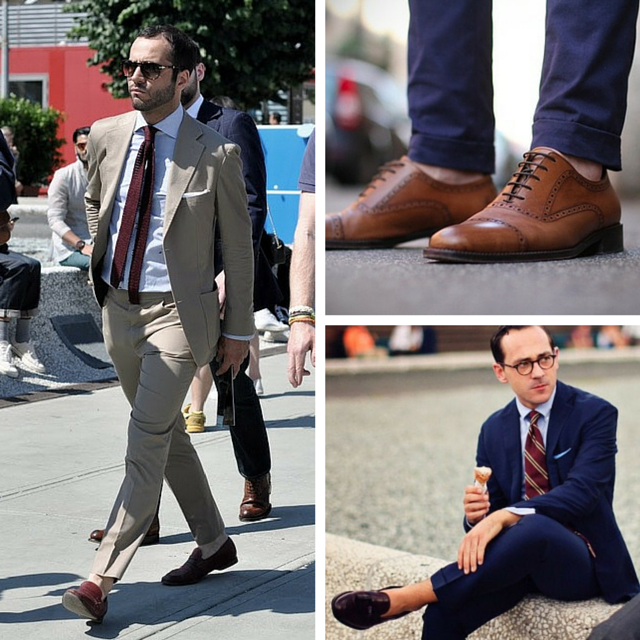
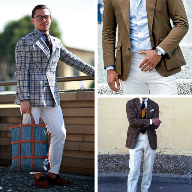
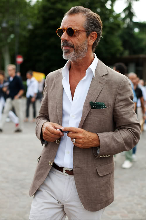
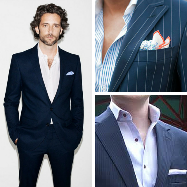
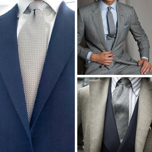
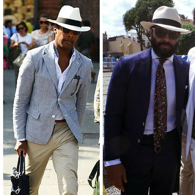
3.  The importance of the dark shirt with a lighter jacket – in the evening.

Darker in the summer?  I know this is a bit of a shift from traditional thinking hence I’m specifically making the point for the evening time when it’s slightly cooler.  Feel free to do it in the day though if you don’t feel it makes you too hot.  With suits and odd jackets we often go lighter in terms of cloth, construction and color in summer.  As such it perfectly sets up the darker shirt combination which is quite striking and on point right now.  It makes the question of whether you should wear a tie moot as a beautiful pocket square will add the necessary pop and formality to the situation.  Here are a few examples:

Dark shirts (1)

4. No tucking with shorts – ever.

This might be controversial but I’m not sure why – it just doesn’t look right.  It’s the old “formalizing the informal” scenario – it makes no sense and there is simply no need for it.  If the situation calls for a tucked in shirt than wear pants and do so – just make sure you go sockless with loafers and keep yourself as cool as possible.

tucked v untucked

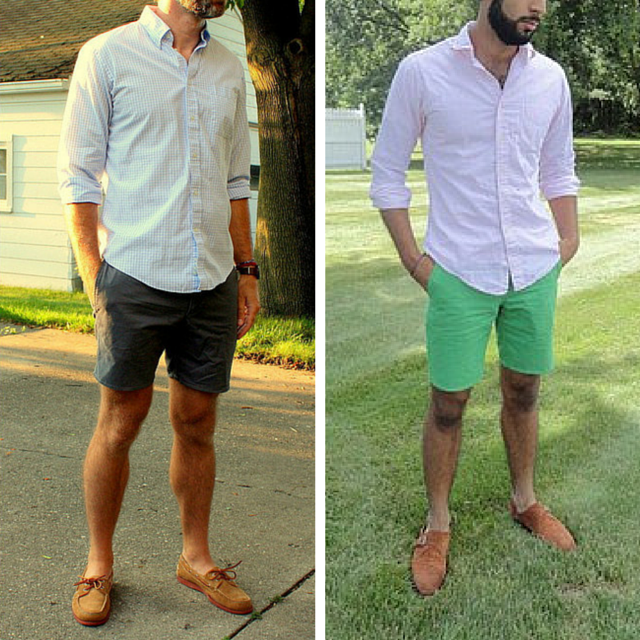
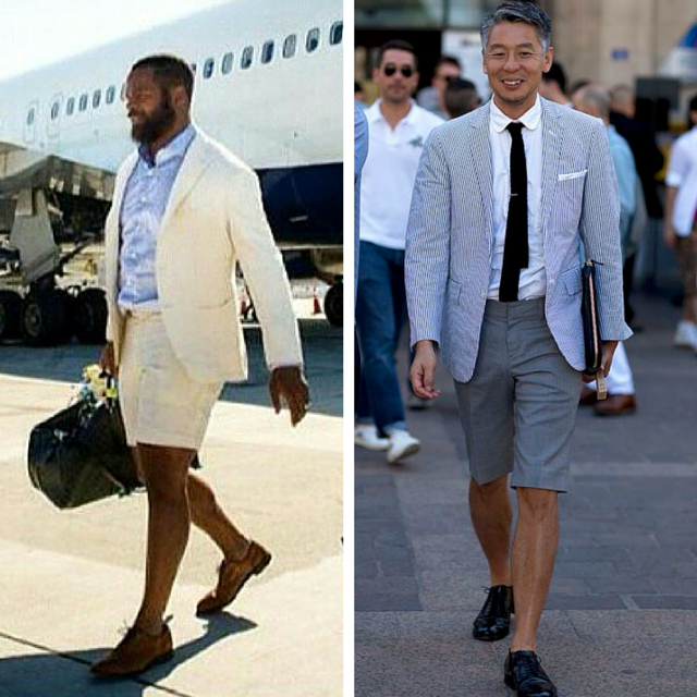
5. What type of dress shirt is okay with shorts?

This is a bit of a back to basics – but before we get going there is one key point that needs to be made.  That is the first rule of dress shirts and shorts – always roll the sleeves.  Wearing the sleeves down formalizes the look too much and puts you in the same category as tucking in.

As for the type of dress shirt – it needs to be a shirt that is designed to be un-tucked.  Specifically it means that it isn’t too long and most importantly it comfortably flows over the hips and seat. I cannot stress the last point enough – all over town I have been seeing guys wearing fitted dress shirts with shorts whereby the bottom of the shirt is catching on the hips which leads to unsightly pulling and tugging.  The bottom line is there are three types of shirts; tucking-in shirts, un-tucking shirts and then the hybrid.  Figure out which ones are which and wear accordingly.  To assist here are two good examples of the hybrid model:

untucked examples

As always I’d love to hear your opinions on this or any sartorial subject for that matter.  Better yet book a free appointment and we can banter in person and see if we might be a good fit to work together.

Take care – Michael

info@martinfishertailors.com

Friday Style Debate: Lack vs Bieksa.

It’s time to debate!

Lack vs Bieksa

Friday Style Debate: Lack vs Bieksa.

For many in Vancouver it was a bit of a sad week as we bid goodbye to two of the most personable Canucks in @eddielack and @kbieksa3 – an unfortunate dose of reality in the business that is professional hockey.

As such I thought it was fitting to say goodbye with an installment on the Friday Style Debate. Based on the images I could (or couldn’t) find it seems that neither player was overly concerned with the tailored aspect of their wardrobe!  If either of you want some assistance in that department I’d be happy to assist the next time the Canes and Ducks roll through town.

With that in mind a debate still needs to occur!  So who who takes the sartorial title between these two?

Let’s debate…

Friday Style Debate: White Trousers?

It’s time to debate!

white trousers (1)

Friday Style Debate: White Trousers?

For those of you in the menswear know you’ll be aware that the menswear trade show Pitti Uomo just finished up in Florence.  Perhaps the most influential show in classic menswear today it also provides a little sneak peek into the possible direction the game is going.  A big trend this year – white trousers.  We’ve been seeing white cotton and denim for years but this year it was wool and wool linen blends.  Lighter and with much more flow it is a bit of a 1940’s throw-back.

So – what do we think of the white trouser?  Here to stay or just another attempt to create a new trend for the sake of it?

Let’s debate…

The Pocket Square – Summer’s De Facto Tie?

On Monday I delivered to a client the softest, most supple wool and linen blend suit that I have yet seen.  It literally appeared to make his body physically cooler within mere moments of putting it on – okay perhaps that’s a stretch but in comparison to the fully lined suit it replaced it seemed that way!  When I asked what he was most excited to pair it with an he stated the following: sockless with loafers, a crisp white shirt and a statement pocket square.  We then got into a discussion about how in the summer the pocket square sometimes takes on the role of de facto tie – a scenario that particularly plays out here in relaxed, dressed down Vancouver. Coming on the heels of last weeks post on ties it seemed like a logical next step in terms of subject matter for this week.

61510Sunglasses_1725Web

The de facto tie?

To many a sartorial purist even asking this question is blasphemous.  To the rest of us it simply makes sense.  As Vancouverites it’s safe to say we’re not exactly accustomed to the heat – by removing the tie and opening the top of the shirt we quickly get much closer to a comfortable body temperature.  We also get that much closer to appearing purely casual – as such enter the pocket square to save us from going to far over edge.

But first a cautionary note.

Before we get into the squares themselves though we need to address the suit itself as not every suit can shed the tie and look right.  Formal and traditional power suits are only that – they need to be worn to their fullest and look incomplete when the tie is removed.  What suit looks appropriate dressed down is often a very personal matter.  For me the following looks are an example of just that – in essence they’re trying to bring too relaxed a mood to a formal base which simply doesn’t work to my eye.

Too formal (1)

To achieve the more comfortable yet appropriate look we desire we need to be going with less traditional business cloths.  Plain cloths that are flat or textured, subtle patterns, open weaves and suits that are lighter weight and more unstructured are where to begin.  The image below is a great example of this – it’s able to walk the line between formal and informal beautifully due to its weight, color, type of weave and its more informal patch pockets.

b25be197638fd9efc0a2467f5889d9d3

Less is more.

I’m going to repeat what I said last week as it’s equally crucial to keep in mind – when we talk about less is more we’re referring to both the design of the pocket square as well as having a very curated selection to keep things versatile and orderly.  May I remind you to keep the 90% rule of the menswear game in mind – that 90% of all suits sold are either navy or grey; and that 90% of the shirts sold are in white, baby blue or a combination of the two.  As such when you’re starting to build your wardrobe it’s crucial to get the basic elements right from the outset. There is a reason for the 90% rule – each element works seamlessly with the other.  Keep that in mind as you build out your pocket square collection.

With that in mind here are some tips to nail your pocket square game.

1. Start with plains.

Sound familiar?  Whether we’re talking suits, shirts, ties or pocket squares the initial rules stay the same.  As stated above seamlessly working together is the first key as is simply becoming comfortable with the act of wearing a square.

plain squres (1)

Do note that white is not the only plain option though it is by far the most common.  Baby blues, forest green, burgundy – these are just a few soft and warm plain color options you could also go with from the start.  As for the border – I must admit that it’s a personal favorite of mine. A way of adding a dash of color in an otherwise very simple look.

2. Add some dots and subtle pattern.

A bit of a departure here – in the tie world I suggest these as two separate steps with the dots coming first.  In the square world we’re allowed to advance much quicker hence the combination.  My advice here is to keep relatively focused in terms of the colors that you add – the goal is a color palette that enables seamless usage while still adding versatility and personality to your overall look.

pocket squares with dots and subtle pattern (1)

3. Go bold.

Again – a bit of a departure.  I’m definitely not a huge fan of the bold, loud tie – that said what I can get behind though is the bold pop of the pocket square. Because the nature of the square is subtle it allows us that much more freedom in terms of its impact.  Below are some personal favorites.

bold pocket squares

4. How to wear it. 

I’m not going to go into this with much depth as the internet is literally filled with hundreds of “how to” posts.  My only point is this – the more bold the square the more bold the way you wear it.  If you look at all of the images in this article by far the ones in the bold section are the most whimsical in terms of how they are thrown into the breast pocket.  Simple and subtle – go with a simple and subtle fold.  Bold and loud – go with the equivalent artistic and architectural placement.

And lastly – a touch of shirt advice.

Darker shirts are definitely experiencing a touch of a renaissance lately – especially when worn casually with a jacket that is lighter.  There are a few examples above and in all of them the color in the pocket square pops quite beautifully in relation to the darker backdrop.  Given that you might want to consider a navy button up shirt – just saying!

As always I’d love to hear your opinions on this or any sartorial subject for that matter.  Better yet book a free appointment and we can banter in person and see if we might be a good fit to work together.

Take care – Michael

info@martinfishertailors.com


Friday Style Debate: The Question of Beltless Pants…

It’s time to debate!

beltless

Friday Style Debate: The Question of Beltless Pants.

In my opinion there is nothing that says “perfectly fitting” quite like a pair of pants without a belt.  Forgoing the loops all together further takes it to the next level as there is simply no going back.  It requires perfection in measuring and cutting as well as consistent exercise to keep the body in a relative steady state.

That said there are many out there who simply feel naked and incomplete without the final touch of the belt.  Which brings us to our question – are beltless pants the peak of perfection or does it leave you feeling something is missing?

Let’s debate…

Ties 101 – It’s all about simplicity.

Over the past few months I’ve had the opportunity to conduct a full wardrobe analysis for a few different clients.  In most cases a theme started to emerge whereby the client lamented the difficulty of finding tie combinations to go with their shirts and suits.  This despite the fact that in most cases the tie collections were in excess of 20 ties!

Ties 101 – It’s all about simplicity.

The reason for their struggles was immediately evident – in almost every case the tie rack was an explosion of multiple colors and patterns.  When pressed to pick out their top five without fail the most calm and basic styles were the ones that emerged from the chaos.  Which leads us to the golden rule when it comes to ties and clothing in general – that less truly is more.

Less is more.

When we talk about less is more we’re referring to both the design of the tie as well having a very curated selection to keep things versatile and orderly.  May I remind you to keep the 90% rule of the menswear game in mind – that 90% of all suits sold are either navy or grey; and that 90% of the shirts sold are in white, baby blue or a combination of the two.  As such when you’re starting to build your wardrobe it’s crucial to get the basic elements right from the outset. There is a reason for the 90% rule – each element works seamlessly with the other.  The same goes for ties.

With that in mind here are the four keys to mastering simplicity:

1. Start with plains.

Far too often the word plain gets a bad rap for being boring – I couldn’t disagree more.  Just because a tie is ornamental doesn’t mean it has to be loud – I’ll take understated and elegant every time.  With that in mind you’ll need the following basic colors:

Navy Ties

Above is the classic navy; below is the classic silver and grey.  Both options are always classy, always in fashion and appropriate for every conceivable scenario from business to pleasure.

Grey Ties

The next four – a deep burgundy, a deep green, brown and a rich purple.  The shade can slightly change but make sure you maintain a richness and depth in the cloth and color.

Green, Burgundy, Brown and Purple.

A key to the plain tie – don’t stick to one style.  Wool ties are fantastic and can add a wonderful level of depth to an outfit.  The yarns also take color in a very particular way thus they have a very unique appearance.  As a result you could have three different shades of navy/blue easily in your collection.  The same goes for silk – in this case the style of weave creates a wide range of different looks.  It can be textured and create depth or it can be tightly woven and flat; each reflects light in its own way and as a result it can elevate or reduce the formality of the tie.  A loose rule of thumb – the more sheen due to reflection the more formal the tie.

2. Add some dots for a hint of flair.

This is a simple way to begin pushing your boundaries ever so slightly.  The contrast of the dots is a lovely way to introduce other colors or simply to lighten the look by adding some visual interest to a plain base.  Here are some examples from the basic navy and grey family:

dots

And now from the other big four colors:

dots #2

3. Subtle pattern.

For those of you who fear being branded too conservative here are a few subtle options for delving into the world of pattern.

Subtle pattern.

Again it’s got everything to do with textures and weave – more often than not this is how we create pattern as opposed to sharp and abrupt contrasts.  This is also a way for us to involve different shades of our core colors to create a more visually interesting backdrop.

Subtle pattern #2

A final statistic for you – this post shows 23 different ties.  7 grey, 6 navy/blue, 4 brown, 2 each of green, burgundy and purple.  There is a range of material, textures and shades of the color within each grouping.  Hopefully this allows you to see the variety that is possible within a very specific and core color base.  This is important to note as it enables your shirts and suits to all pair perfectly together.  The joy of simplicity.

4. Two out of three rule.

Last but not least is the two out of three rule.  This applies to the trinity of the suit, shirt and tie. Essentially it means that two elements should be calm and grounded while the third can be equally grounded or add pop if you prefer.

Wearing a loud and expressive suit; it’s best to ground the look with a subtle shirt and tie combination.  Loud and expressive shirt; ground the look with a neutral suit and tie.  I think you get the point.

As always I’d love to hear your opinions on this or any sartorial subject for that matter.  Better yet book a free appointment and we can banter in person and see if we might be a good fit to work together.

Take care – Michael

info@martinfishertailors.com


An ode to Scotland…

Suit jacket for JD of @hole72golf – when your profession is golf it seems logical to have an affinity for golfs spiritual home of Scotland.  And yes those are unicorns on the lining!  For those of you who don’t know – Scotland’s national symbol is the unicorn.  Pretty sensible for a country so famed for its love for and long history of myth and legend.

20150613_095910


5 Tips to Nail Your Summer Wardrobe…

If you’ve been reading the journal with relative frequency you’ll know that I’ve been loosely touching on summer attire over the last month or so.  That said it’s been within general discussions so here is a more summer specific post to get you sorted for a great summer ahead.

5 Tips To Nail Your Summer Wardrobe.

1.  Unlined + unstructured.

I’ve discussed this topic a fair amount but I want to make sure we’re totally clear on this one as it’s fundamental to your keeping cool this summer.  When we talk about unstructured jackets we’re talking about what goes on in the inside of the jacket – particularly the chest and shoulder area.  The less padding in the shoulders and firmness in the chest piece the more unstructured it becomes – in other words we shed internal layers to lighten the jacket as much as we can.

The key for summer though is to go one step further and have a completely unlined jacket.  This further reduces the layers in the jacket and crucially enabling air to pass through the jacket in a far easier manner which is of course the key to maintaining your cool.

Hand Made Unlined Sport Coat

As you can see in the image above all that remains is a few strategically placed pieces of lining – to cover the vent, a touch on the upper shoulder for comfort and the sleeve lining so arms can smoothly slide in and out.  Otherwise its light, airy and soft as can be.

2. Cloth selection.

Hand in hand with the type of structure you choose for your jacket is the cloth.  We want light, airy and most importantly a looser weave in terms of the structure of the cloth.  Quite simply the looser the weave the more air that will be able to pass through the cloth which will keep the body cooler.  Another feature of this weave is that it is more resistant to wrinkling which is a bonus come the hotter weather.  Linen blends – be it with wool or cotton are a great choice as is the classic wool mohair.  Other choices include a wool hopsack, a tropical wool or a fresco wool. The key with all of these – the yarns that make the cloth up are all very fine and of a high twist nature which allows them the strength to have a looser weave hence more air flow and breathability.

3. Color.

A bit of an obvious point here but one worth repeating.  We generally tend to wear lighter colors in the heat because they reflect the sunlight as opposed to darker ones which absorb it.  It’s why white, beige and the lighter shades of brown, the lighter shades of grey, olive and shades of blues are so popular for summer clothing.

The key take away here though is that the color alone won’t save you.  It’s when combined with an unlined and unstructured jacket and a looser weaved cloth that the effects will be maximized.

4. Fluidity

This is perhaps the least discussed element of keeping cool in the summer – I’ll chalk it up to the fact that the trimmer silhouette has been dominant over the last few years.  With a slightly more relaxed trim aesthetic gaining momentum though it couldn’t come at a better time.

As you’ve no doubt noticed the dominant theme thus far has been to maximize air flow.  Put simply the tighter the clothes the less air that can circulate over the body.  This leads to greater friction as the cloth rubs against your body which leads to more heat, more sweat and greater general discomfort.  Which is why relaxed trim is so crucial for the summer – a touch more ease in the silhouette allows for this circulation which when combined with points 1-3 will leave you feeling pretty comfortable even during the hottest days of August.

f32af443fe39dbb8a276cb45d06e39e7

The image above sums points 1-4 up quite nicely.  Unlined and unstructured, a loose and airy weave in the cloth, lighter color scheme assisting in reflecting the sunlight as well as a relaxed trim fit that leads to a fluidity and lightness in the way the clothes drape on his body.  The picture was taken in Florence in the height of summer thus it is hot and sticky yet he seems totally at ease.

5. Yes to no socks and hats; avoid the shorts + jacket look.

A bit of personal opinion here – take it or leave it from an advice point of view!

A few weeks back the Friday Style Debate took on the sockless question and by far it was supported by most of you.  I completely agree.  Some thoughts though – be wary of the shoe you do it with.  Loafers always look great sockless.  As for laceups – be careful as it can come across as too affected if you don’t pull it off right.  The key in my mind comes down to the break on your trouser – or lack there of.  If you’ve got the body to go slim and short it looks great.  If your size or build means you wear your pants a touch longer then I’d avoid.  It’s a bit of an all or nothing kind of thing.

As for hats – no question they are critical to the summer wardrobe.  I never wore one until last year when I spent some time in the Florida Keys and now I cannot go back.  A brutally hot day becomes manageable with the right hat – it protects you from the sun, soaks up some inevitable sweat and provides a great hit of whimsical style that is often lacking when you have fewer layers of clothing on.

Hats II

And lastly – the short + jacket look.  Fitting that this comes last as this subject is always a lightening rod!  My take is this: jackets are formal and shorts are not. Formalizing the informal simply makes no sense.  That said I’m sure many of you will disagree with my sentiments and I support that completely.  If that’s the case and you’re going to go for it anyways may I suggest these two examples as guides –

shorts + jacket II

The reason these two work for me is that there is a light and airy feel about both of them.  Furthermore each guy seems to give off a touch playful spirit which in my opinion is critical in pulling off this look successfully.

As always I’d love to hear your opinions on this or any sartorial subject for that matter.  Better yet book a free appointment and we can banter in person and see if we might be a good fit to work together.

Take care – Michael

info@martinfishertailors.com


Always dress for you body type…

This weeks post is inspired by two things – firstly the many responses to last weeks introduction to relaxed trim discussion; and secondly by two guys I saw on Monday as I was walking to a fitting downtown.

No question over the last decade and a half the menswear game has changed dramatically.  I point to the rise of David Beckham as a fashion icon and the impact of men’s magazines such as GQ and Details in the early 2000’s as the driving forces behind this change.

Beckham and GQ

Coupled with the recent emergence of social media and a new monster was born – on more traditionally found in womenswear.  I’m talking about the emergence of trends in the menswear game at a level not seen before; the result being a real narrowing of what is viewed as “on-point” in terms of styling and silhouette.  This is why the subtle shift I spoke of last week is so important.

Always dress for your body type.

The starting point that I use for all my clients is that they need to dress for their body type.  To do this though one has to be honest in terms of how they assess their body.  There are a lot of styles that I like out there but the reality of my body means not all of them are attainable. Having this awareness is of course easier said than done – something which has become even more difficult with the narrowing view of what is “on-point”.  As a result I see far too many guys trying to pull off styling that isn’t suited for their body type.

This point was hammered home for me on Monday as I walked along Burrard from Hastings towards Dunsmuir.  Apologies for no photos but I couldn’t bring myself to ask or take a shot without permission.  The first guy was dressed casually and absolutely on-point from a style perspective – an untucked navy button-up shirt with the sleeves perfectly rolled, beige chino’s and white sneakers sans socks.  Not a lot different from this guy who the Sartorialist shot in Milan a few years back:

GC[1]

Where it went wrong though was in the proportions.  He was a heavier set guy – particularly in the mid section (re. belly and seat).  The pants were extremely tapered and “stylishly” rolled well above the ankle in keeping with a J Crew advertisement.  The problem was that the taper and roll enhanced the size of his mid section to the point that the stylishness of the look was irrelevant.

The second scenario also involved a very well put together guy who like the first is very aware of what looks are trending right now.  He had a very athletic build – probably in the 6 ft 2″, 210 pound range and very cut.  The proportions of his suit were dead-on for his frame as he didn’t go too slim – he went to the edge but not over.  I could tell this was the case as he had very developed calves and I could see that the pant was as trim as it could go without catching on them.  Where did he go wrong then?  He got caught up in the trend game and cut the pants way too short.  Due to his size the pants at the bottom had too much width to cut short – they were wildly flopping around as he walked which took a great suit and made it look comical.

thin vs normal

The image above is a classic example of rail thin versus athletic and bigger.  The short and trim look works great with a thin body type but a bit more length and width is required for a bigger body.

Be honest with yourself.

In both cases these guys did almost everything right.  Their only mistakes were not adapting the looks to their body types.  Keep in mind that all models are tall and rail thin; this body type that designers and the fashion machine at large use as their baseline.  A recent J Crew brochure listed the models height and weight as a guide for fit – in this case he was 6 ft 2″ and 165 pounds.  I’m not sure about you but I don’t know too many guys that rail thin.  I’m less an inch and have 20 pounds on that guy – I’ll never be able to wear things in the same way as him.  It doesn’t matter how much you like the look – every time you need to assess if it works for your body type.  And when doing so be honest with yourself.

How to adapt.

As I said before all of these styles are designed with the tall and thin in mind.  Short and thin – you can get away with it.  If you’re medium in build you’re also likely to be fine irregardless of height.  Where things need to get tweaked is if you have muscles or are carrying a bit of extra weight; a boat which holds most of us.  Here are a few keys to keep in mind.

1. Fluidity

When you’re not rail thin and devoid of muscle mass it is crucial that your clothes fluidly move and interact with your body.  Every time we move our muscles expand and our body mass reacts in some way.  The fit of our clothing needs to reflect this fact otherwise it will catch and pull.  These stress marks never look good despite how slimming the effect might be when you’re not moving!

2. Know how your clothes respond on your body.

I’ll admit this is a bit of a difficult one – I’ll explain using my seat as the example.  After years of squats I have a pretty developed seat – particularly in the upper seat area.  Further to that my root foot is dominant and through years of sport my right seat has ended up being more developed than my left.  Still with me?

This means a few things.  The first being my pant waist is driven upwards at the back due to my developed upper seat.  It is worse on the right side as its pushed even higher – this leads to the waistband sitting on awkward and uncomfortable angle.  As a result a low waisted pant is out the question for me despite the fact that I like the style of the look.  Why?  It rests on the upper seat level and hence it moves with every step I take.  The solution is a higher sitting pant that enables more fullness over the upper seat area and reduces any excess movement in the waistband itself.  This is both more comfortable and looks better as it allows for a more fluid transition over the seat.

The take-away – comfort and the realities of your body will dictate what type of looks you can and cannot go for.  Always let your body dictate and you’ll be fine.

3. Don’t do it.

Some basic rules to guide you with two of the most popular looks these days –

  • Tapered Pants – If you have a big mid section – particularly in the seat area – then your taper in the pant leg has to be subtle.  Too much and it simply visually enhances the size of your seat which is obviously not the look you’re going for.
  • Cropped Pants – If you’re going to go with the short cropped pant look make sure the width of your pant bottom is less than 15″ at a minimum.  Any bigger and it will flap as you walk and look comical.  Depending on your seat and quad size dropping into the 14″ range is absolutely fine.  Keep in mind that it needs to be proportional with the size of your shoe – the bigger the shoe the more width you need.
  • Just to be clear – if you put the top two together it means that if you’re not very thin you probably shouldn’t be going for the skinny and cropped look.  Thinner and shorter are fine – play with the width and length to find out what works for your body type.  Chances are it will be a bit of trial and error.
  • And lastly – a jacket should never have stress lines emanating from the button closure. Somewhere along the way in certain circles this has become viewed as an indicator of a good slim fit jacket – it’s not.

As always let me know what you think – your comments are always valued and guide me in what subject matter I will discuss next.  Don’t hesitate to book a free appointment today and we can discuss these matters in person – I look forward to hearing from you.  Take care,

Michael

info@martinfishertailors.com


Friday Style Debate: sockless in the summer?

Time to debate!

sockless with suits

With the warmer weather arriving the questions about summer weddings and daily suit wearing have hit full stride.  No subject in this department is as divisive as the sockless with a suit look.  No doubt the air hitting your ankles and flowing up the pant leg brings comfort – the question is will you actually do it though? Some find it makes perfect sense while others find it way too fashion forward and trendy (despite the fact that the Italians have done it forever).

So where do you fall – will you sport the sockless look with a suit this summer?

Let’s debate…